
Online Recruitment Platform Case Study
OUR ROLE FOR LOCAL JOBS
- UX/UI Design
- CRM Development
- Cosulting Services
- Front-end
- Back-end
- SEO
The Project
Local Jobs has one mission: to create perfect matches between jobs and people.
It’s a bold statement for this modern age, but nothing can hold back a passionate team. These days the process of job hunting is no longer sneaker-powered so everything started with their website. Then they made the recruitment process easy for everyone, they brought competitive deals into play and the ground was laid for a fully-fledged business.
Online recruitment services have been around for a while now and so have the big players that lead the industry. That meant creating a platform that was at least as appealing as the as anything advertised by the competition. On top of that, it had to be focused on usability, maximum engagement and top-notch customization.
We started this project with a primary target in mind: to engineer a website that is effective specifically for Local Jobs. In other words, the main focus was on what they have to offer, in comparison to traditional recruitment platforms. That meant a highly complex back-end structure and an engaging, user-friendly design.

The Team
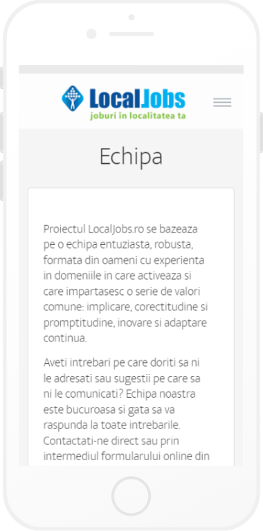
Our attention was focused on the complexity of the project, which implied a lot of resources on both sides. Therefore we cannot but compliment the awesome team behind it: a back-end developer, a front-end developer, a designer, a QA specialist, a product manager.


Discovery & Research

We limbered up by getting to know the company, what drives them and their mission. From that point on it was easy to identify the target groups. It went without saying that we needed a hefty website ready to accommodate heaps of users and tons of information. But it also had to exhibit commitment to aesthetic design. We all know that the look, colour and feel of one’s website are critical when it comes to first impressions.
Prototyping & Testing
We focused the first round of testing on pure usability since hunting for jobs can be quite time-consuming. That’s why any scrolling, clicking or needless staring can result in major frustration. In this regard, we made sure to eliminate any annoying pop-ups or navigational flaws. In the second round, we evaluated the relevance of the search results. The search algorithm is the bread and butter of a job site, so we checked the listings to make sure they are fresh, accurate and easy to scan through
3 Interviews
+45 Wireframes
2 A/B Tests
2 Prototypes (Desktop / Mobile)
2 Iterations
+50 Detailed UI Screens
Solution
We kicked off with a solid wireframe based on the business objective and the creative idea we had in mind. Then we focused on custom features that would bring this kind of business to the next level.
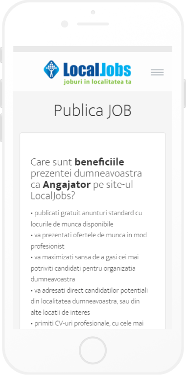
- Custom alerts, for instance, are one of the core components of a job search platform, since as an employer, you want to be notified as soon as you have new applicants. The same goes for candidates who are anxious about their application status.
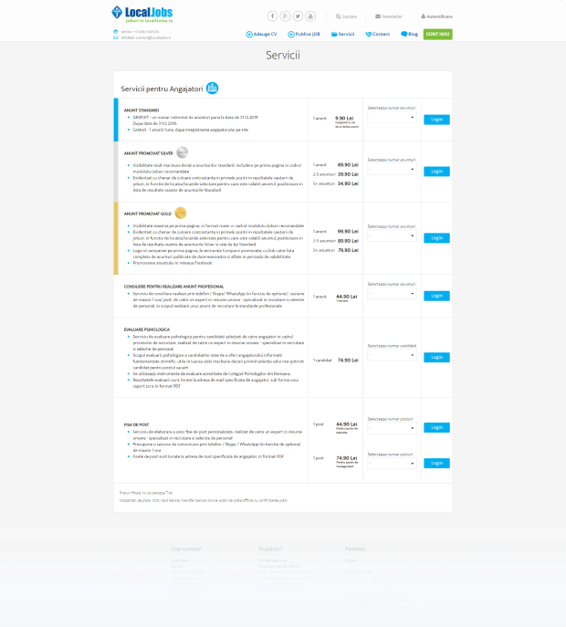
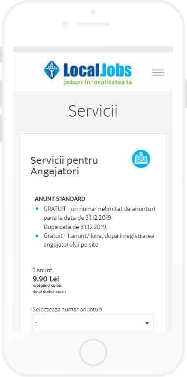
Another key element for such an industry is the tiered pricing, so we enabled our customer to offer multiple package deals, according to the end user’s needs. - Furthermore, we developed a user-friendly CV management system for the quick creation of professional resumes which could also be effortlessly analyzed by employers.
As soon as we were satisfied with the features of the website, we started polishing the path of the users. As a result, we ended up with a modern, easy-to-use environment where even the most novice tech users can find their way. Plus, everything was running smooth and snappy, which meant we did a pretty good back-end job.
Website Design
The next step was adding typographic style, colour and graphics. We implemented a simple, clean and functional design that boasted professionalism. Not to mention, we included an interactive national map to add a touch of familiarity and intuitive navigation.
Thus the users are more inclined to stay longer on this site than on a cookie cutter site.
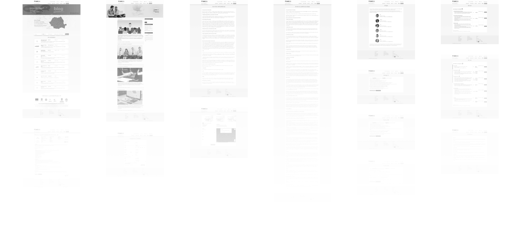
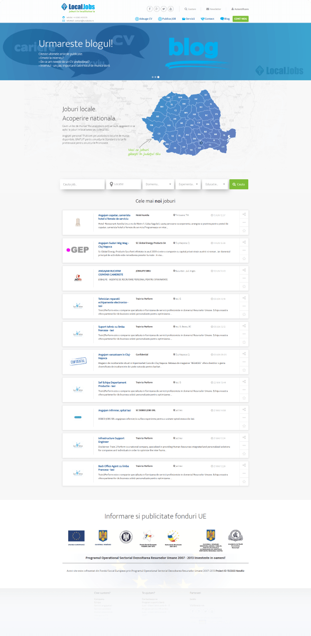
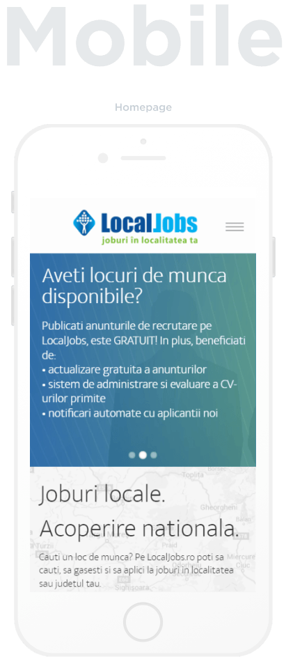
Homepage
Services
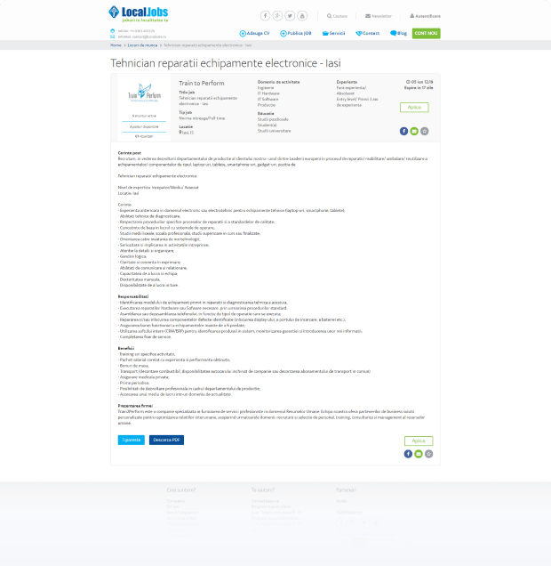
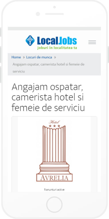
Job Listing Page
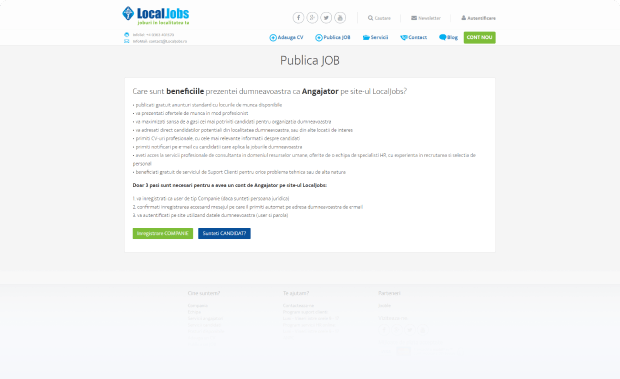
Publish Job
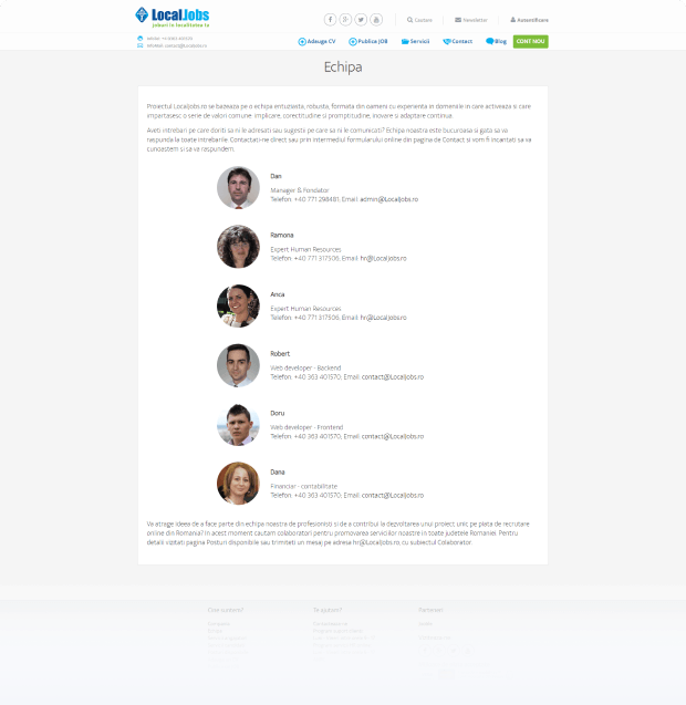
The Team
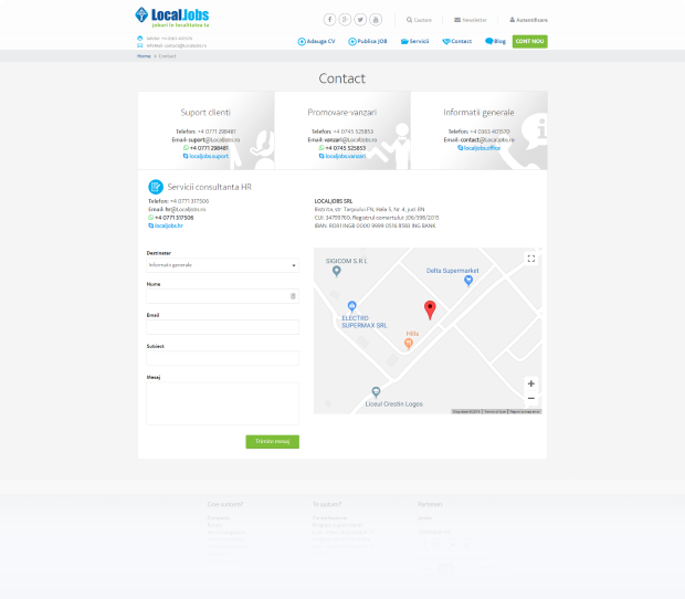
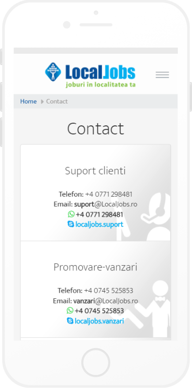
Contact
-
Services
Job Listing Page
Publish Job
The Team
Contact
Takeaways
Stick to smart and simple!
A job searching engine needs to load quickly, show easy-to-read listings and lure the users by quality results without any overwhelming details.
Always research the target audience!
When it comes to websites, both the structure and design will require highly personalized features according to the targeted groups.
Make sure you understand the core of the business!
A notion that is more than valid when it comes to upper-class tastes. Because simplicity and clarity combined with awe-inspiring pictures lead to great design.
Final Thoughts
The truth of the matter is this project was both challenging and gratifying. It was great to clarify the desired results from the beginning because this helped to plan accordingly. But the most fascinating aspect was to be able to propose creative solutions that made the platform really stand out among its competitors.